Last time, we talked about how to georeference weather charts and display them using qtVlm. Now we get to do the easy part, which is to layer GRIB data over those charts in a way that allows you to see a much better picture of the weather forecast than using either product alone. I plan to update both weather charts and GRIB data at least once a day on our planned Atlantic passage.
Coastal sailors used to downloading several megabits of GRIB data using their cell phones will have to learn to trim their data habit down to size. Even with an unlimited satellite plan, you don't want to be downloading megabits of data. With big downloads, the connection will drop multiple times, forcing you to retry the download over and over. It's a big pain, so I try to download just the data I really need. Luckily, qtVlm makes this very easy.
So, what data do we really need? I plan to use the GRIB data for both weather forecasting and for weather routing. So I plan on downloading the GRIB data for the 'corridor' that includes all the possible routes I might take in the next week or so.
For example, I don't plan on sailing too far north of 40°N when sailing from the Chesapeake Bay in the US to the Azores. So for the first week of sailing, I will choose an area between, say 35°N and 45°N, from the US East Coast to about half-way to the Azores, or 40°W.
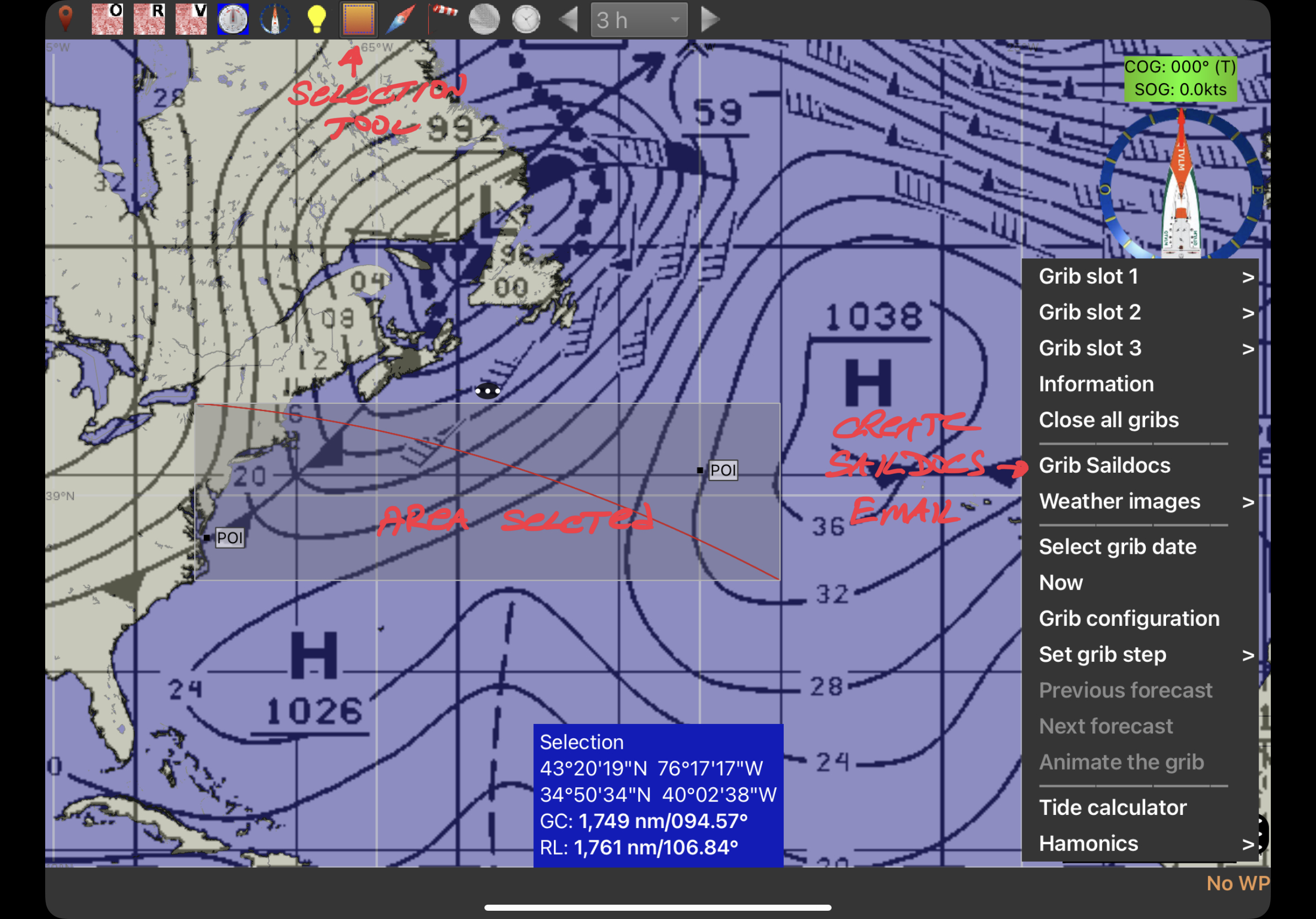
But actually, I will choose this corridor graphically, using the square 'Selection' tool in the qtVlm tool bar.
Selecting area for GRIB data graphically
The steps are (see image above):- click the Selection tool in the tool bar
- click and drag to select the area you want to fill with GRIB data
- click the Menu button in the lower right corner
- click 'Grib Saildocs' menu item
- select Grib parameters
- scroll down and click 'Send Email' button
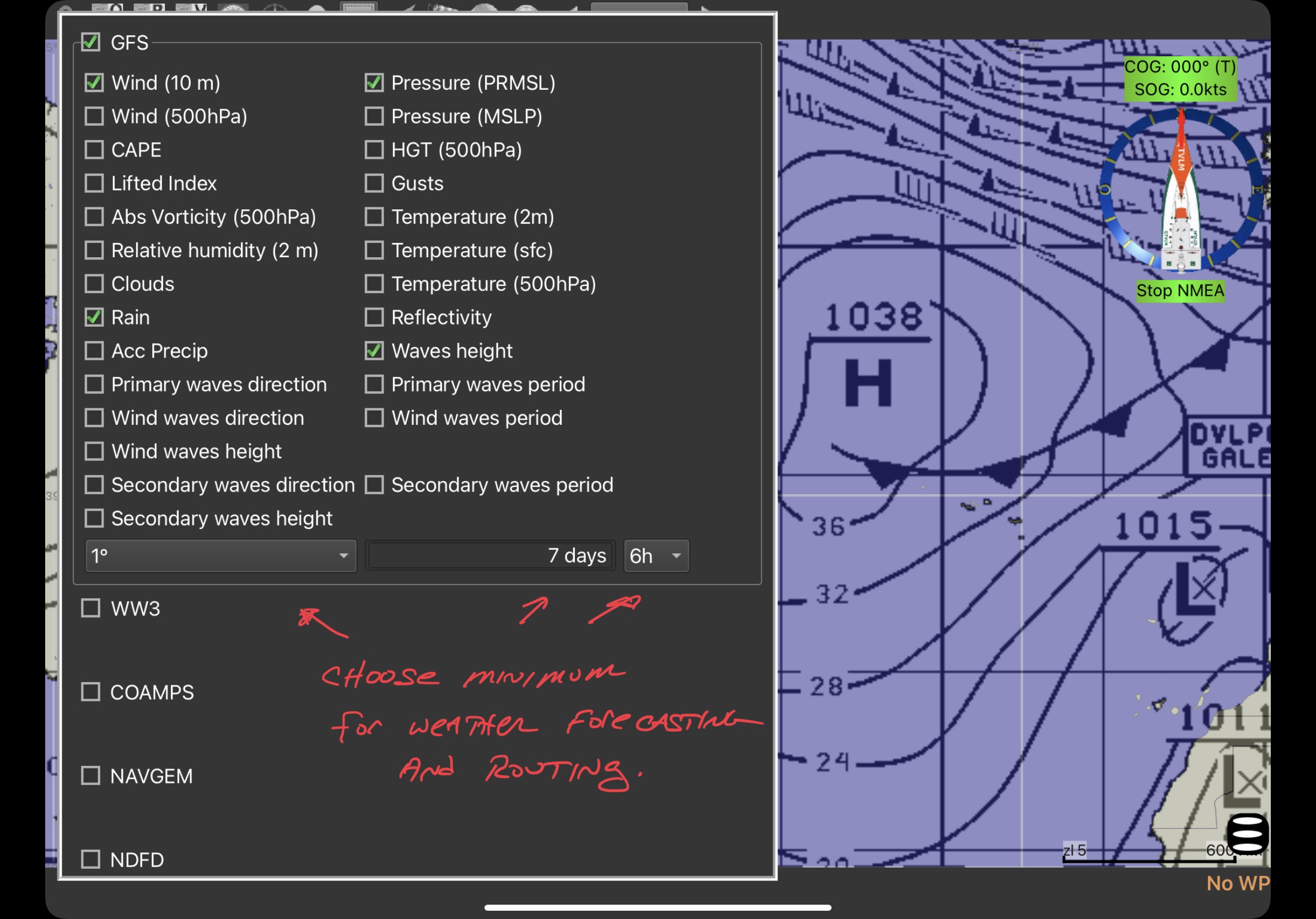
Specifying as small a GRIB file as possible
Clicking 'Send Email' will generate the request in either your normal Mail program, or in Iridium Go mail, depending on whether you are experimenting at home or working at sea. You can choose which type of email to use in the qtVlm Configuration.
After you send your Grib request, you will receive the data back by email. It is then easy to load the data into qtVlm. Just click on the data icon at the bottom of the email, and you will be given a selection of apps which can load the data. Choose qtVlm. It's that easy.
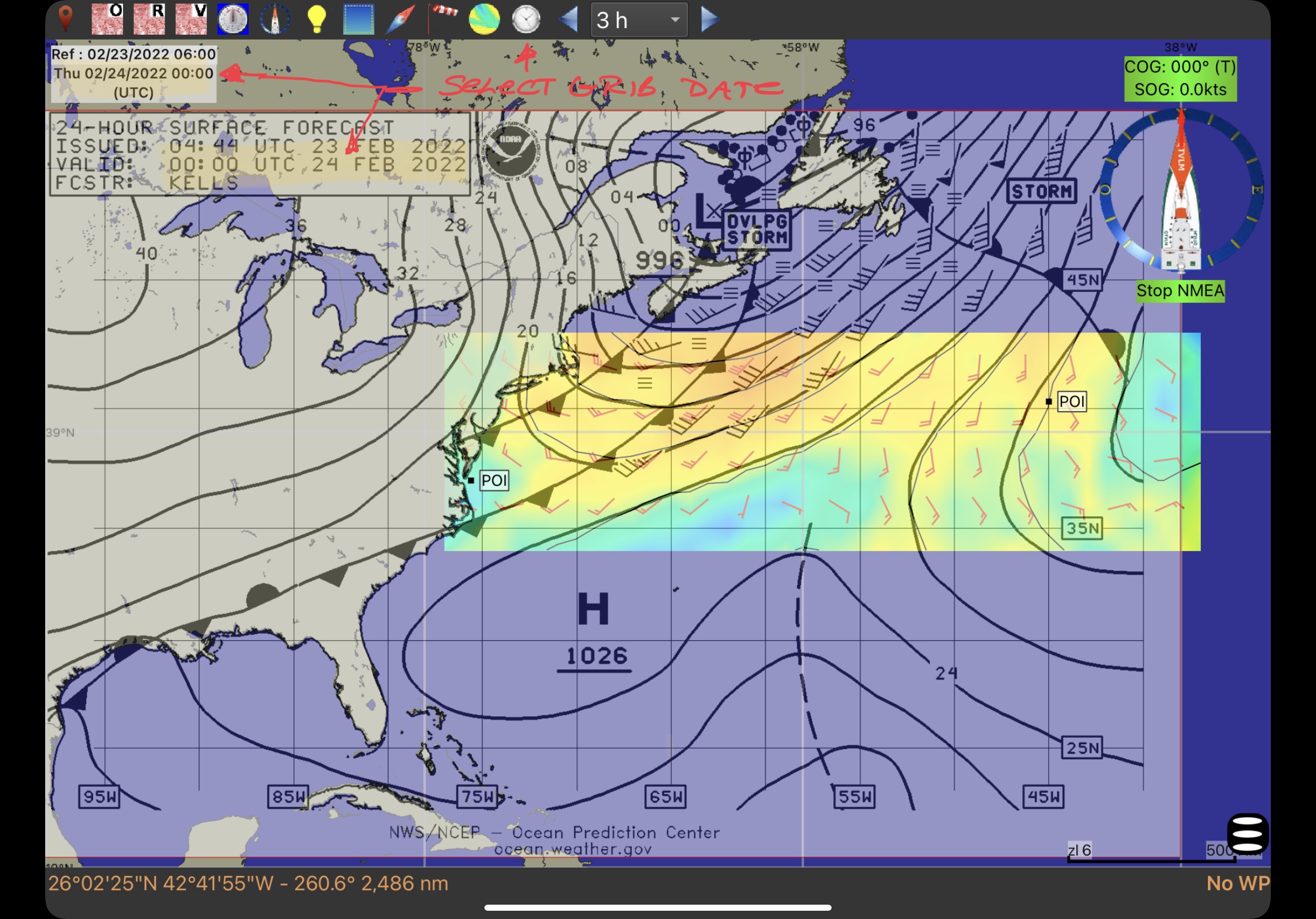
Choosing the right GRIB date for the
right weather chart
Once you load the GRIB data from the email, it will be displayed in qtVlm. Since the Grib data is already georeferenced, there are no extra steps to do to position it on the chart.
However, there is one more very important step (you knew it, right?)
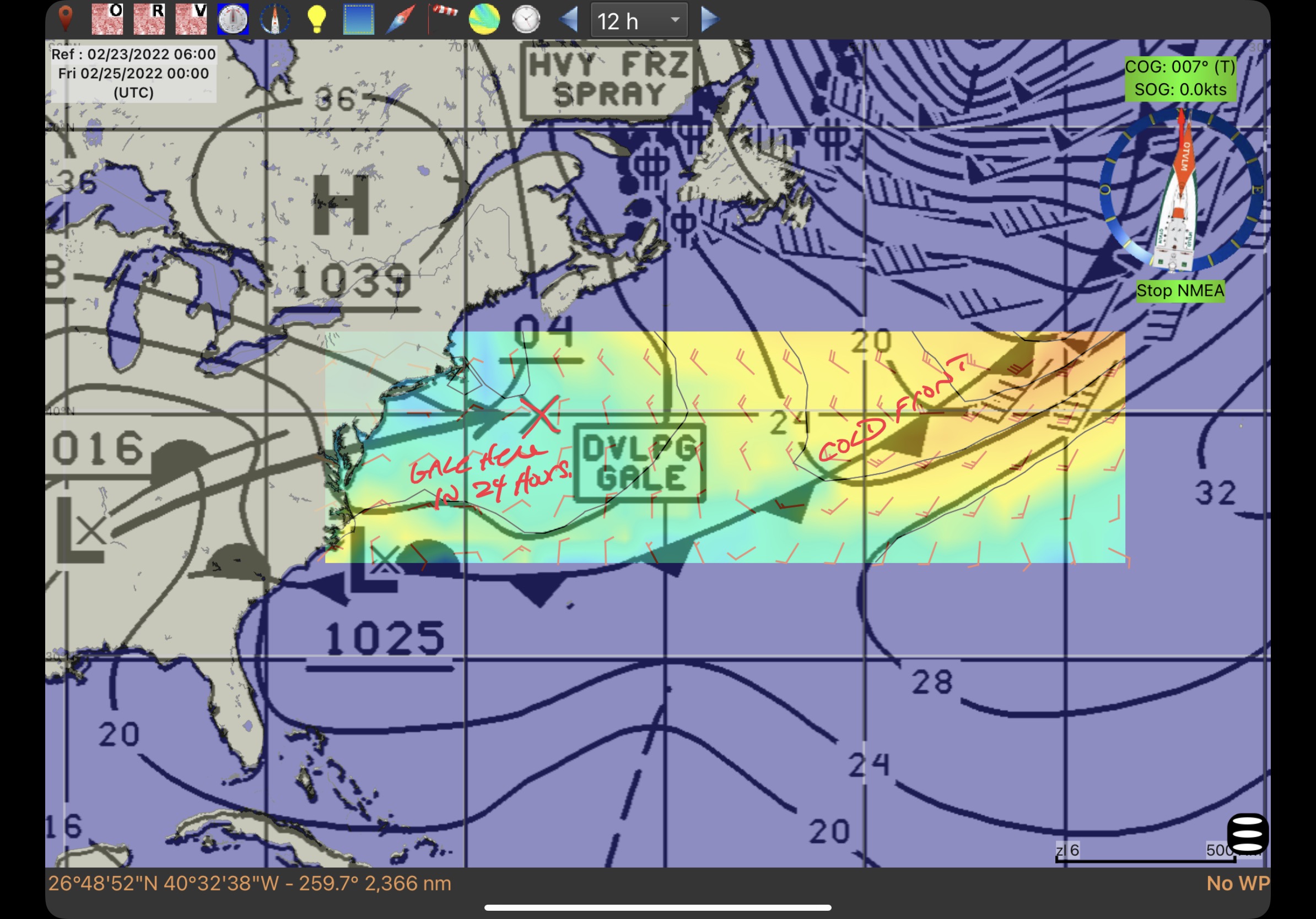
A weather chart, such as the 24-Hour Surface Forecast chart, is drawn to forecast the weather at a specific date and time. In the image above, it's for 24 Feb 2022, at 00:00 UTC.
To properly overlay the GRIB data on this chart, you must set the GRIB date to be the same as for the chart. This is done using the 'Select Grib Date' tool on the tool bar. It looks like a clock. To set the Grib date, you click on this tool, and use the date selector dialog box to choose the same date and time as the chart. I've already done that for the image above. You can see the current Grib date/time in the upper-left corner: "Thu 02/24/2022 00:00 UTC" -- the same as for the Valid time on the weather chart.
Once you do this, you will have the weather forecast chart, and the Grib data for that chart at the same time. You can see the strong winds circulating counter-clockwise around the "Developing Storm" over Labrador, the two nasty-looking cold fronts off New England, as well as the high pressure area coming in from off of Florida, and the winds circling clockwise around a high which is off the screen to the right.
The weather chart gives you the Big Picture which puts the Grib data into a bigger context, which makes it easier to understand, I believe. Look at the Grib Data alone for the 48-hour forecast, without the 48-hour forecast weather chart behind it:
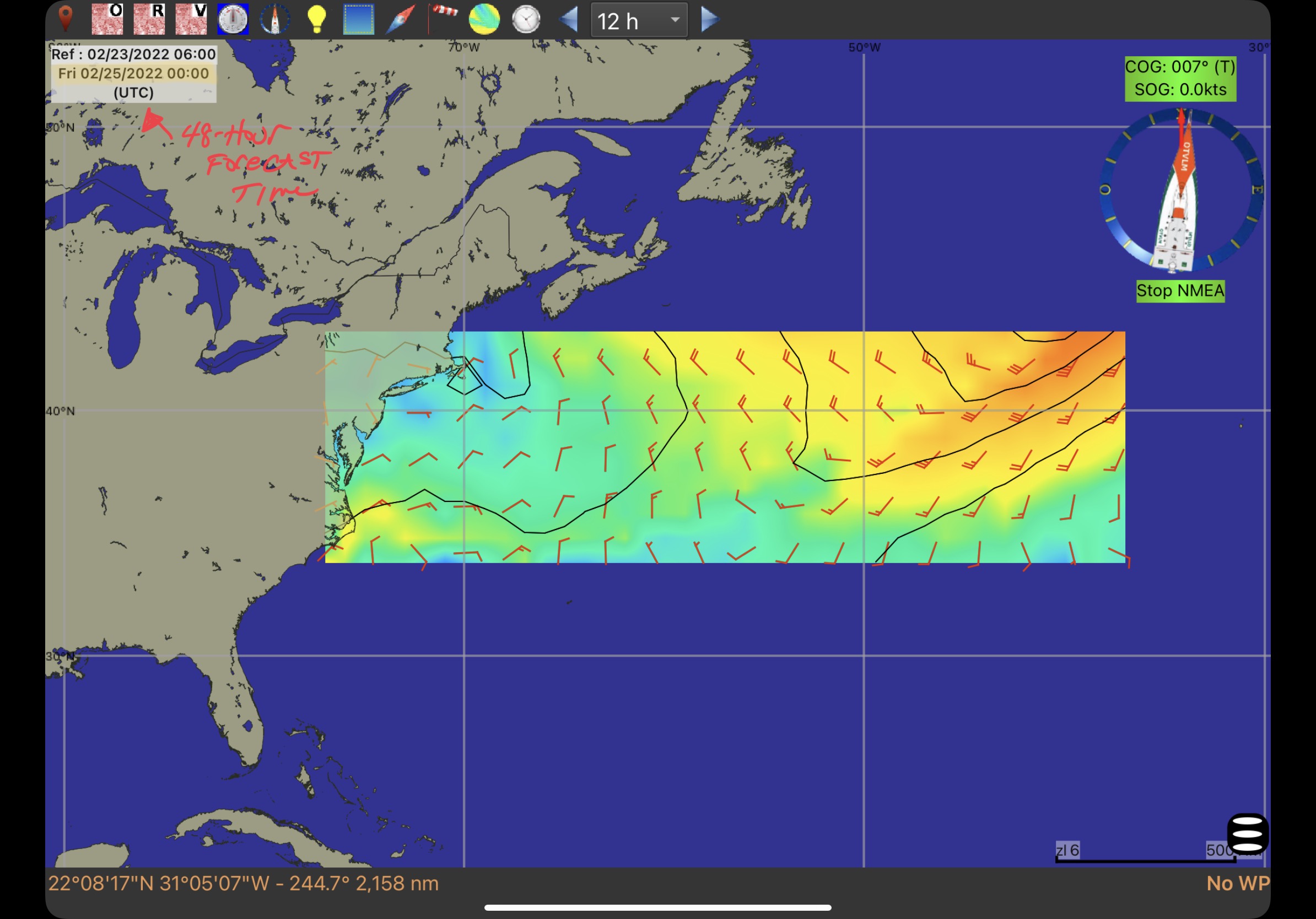
Grib data alone for the 48-hour forecast
If you are used to looking at weather charts, it's probably clear that the storm has moved off to the east, and maybe the high that was off Florida has moved north, but if you are used to just looking at GRIB data alone, you might be pretty vague about what else is going on here. Like the nasty cold front that you definitely want to know about.
Look at the same data with the 48-hour Forecast chart behind it:
48-hour Grib with 48-hour forecast chart
There is just so much more context for the Grib data, that makes it easier to understand, I think. It's this big-picture context that weather charts provide that make this exercise worth-while, if not essential.
And the benefit goes both ways. If the weather charts provide the big picture, the Grib data allows you to see what is forecast between the forecasts. You can step through the Grib data hour-by-hour in the usual way to have the convenient, continuous forecast that Grib provides. I believe that viewing charts and Grib data together like this gives you the best of both worlds. I am utterly thrilled that qtVlm finally allows me to view this kind of comprehensive weather forecast on my iPad. Fantastic!
Well, that just about wraps up the longest blog post I've done in all 12 years of writing these posts, but I personally think it's one of the most useful I've ever done, at least if you are interested in crossing oceans. I can see from my web stats that only about 75 readers have stuck with me through this discussion, so if you're one of the 75, congratulations! I'd be interested in hearing your thoughts and ideas.
Actually, I have one more closely related post to do on this subject. Something I've also wanted to do for a long time, which is to display pilot charts on a charting app like qtVlm. I've JUST figured out how to do that, so that's what we will talk about next time.
À bientôt from the sunny south of France!
No comments:
Post a Comment
I'd love to hear from you. Please comment!